Understanding CSS Grid: A Comprehensive Guide for Designers
- admin
- 28 November 2023
- Uncategorised
- 0 Comments
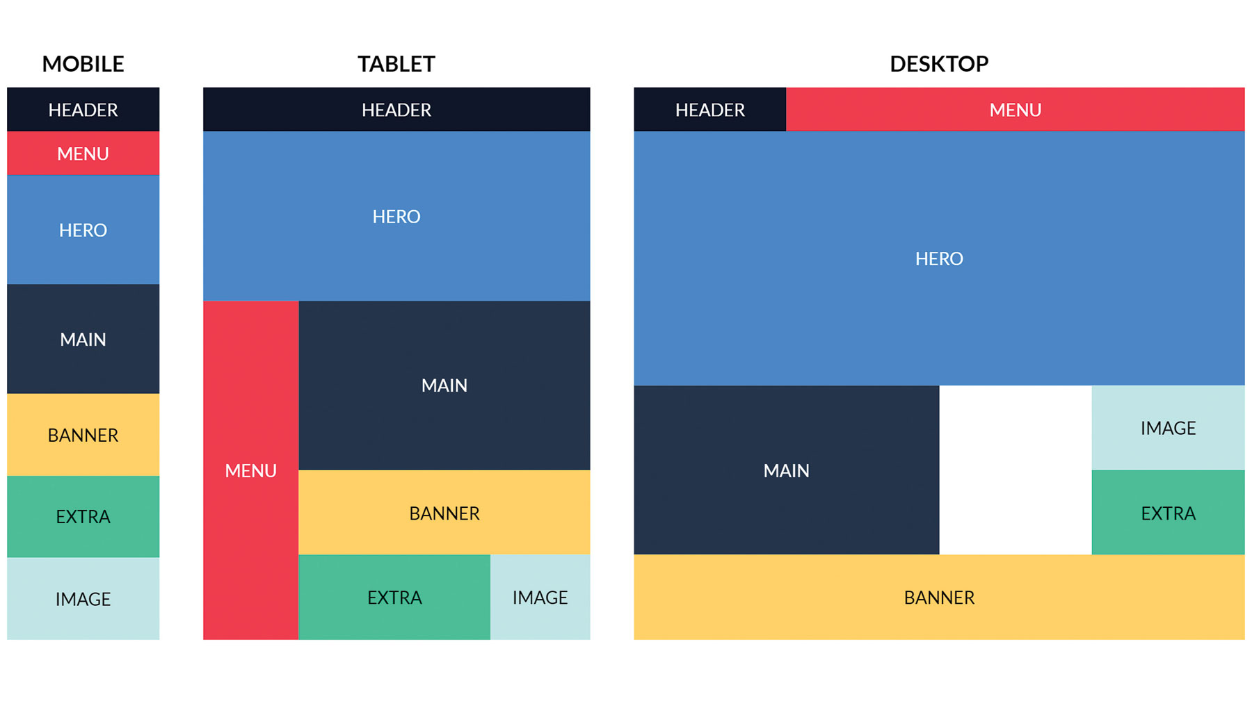
CSS Grid has revolutionized the way web designers create layouts, offering powerful capabilities for building complex and responsive designs. Understanding and mastering CSS Grid empowers designers to create versatile and visually stunning layouts with ease. Let’s delve into a comprehensive guide to CSS Grid, exploring its features, functionalities, and practical applications.What is CSS Grid?CSS Grid is a two-dimensional layout system that allows designers to create grid-based layouts with rows and columns. Unlike traditional methods like floats or positioning, CSS Grid provides precise control over the layout structure, enabling the creation of complex designs without relying on excessive markup or frameworks.Basic Concepts of CSS Grid:
display: grid property.Grid Items: The children of the grid container that are placed within the grid cells.Grid Lines: The horizontal and vertical lines that form the grid, defining columns and rows.Grid Tracks: The spaces between the grid lines, forming columns and rows.Grid Cells: The individual units created by the intersection of rows and columns.Key Features and Benefits of CSS Grid:1. Explicit Grid DefinitionCSS Grid allows designers to define both the number of columns and rows explicitly, providing granular control over the layout structure. Grid lines and tracks can be precisely defined using properties like grid-template-columns and grid-template-rows.2. Grid Alignment and PlacementDesigners can align and place grid items using properties such as justify-items, align-items, justify-self, and align-self, enabling precise positioning within the grid cells.3. Responsive Design with Media QueriesCSS Grid seamlessly integrates with media queries, allowing designers to create responsive layouts. Changes in grid structure, such as column widths or row placements, can be adjusted based on different screen sizes.4. Grid Gap and SpacingThe grid-gap property enables designers to add spacing between grid tracks, providing consistent and aesthetically pleasing gutters between columns and rows.5. Nested Grids and Complex LayoutsCSS Grid supports nested grids, enabling the creation of intricate and multi-dimensional layouts. This flexibility allows for the creation of diverse design patterns and complex structures.Practical Applications of CSS Grid:1. Website LayoutsCSS Grid is ideal for creating entire website layouts, from headers and footers to content sections, offering a more efficient and cleaner way to structure web pages.2. Magazine-Style DesignsThe versatility of CSS Grid makes it suitable for magazine-style layouts with varied content structures, such as articles, images, and advertisements.3. Responsive Grid SystemsDesigners can leverage CSS Grid to build responsive grid systems that adapt seamlessly to different screen sizes, ensuring optimal user experiences across devices.4. Dashboard and Data VisualizationFor dashboard designs and data-heavy applications, CSS Grid’s ability to handle complex arrangements of elements makes it a powerful tool for organizing and presenting data.ConclusionMastering CSS Grid empowers designers to create sophisticated, responsive layouts while maintaining clean and concise code. Its flexibility, control over layout structures, and support for responsive design make it an indispensable tool for modern web design. By understanding and harnessing the capabilities of CSS Grid, designers can unlock a world of creative possibilities in crafting visually compelling and user-friendly web layouts.
Related Posts


